
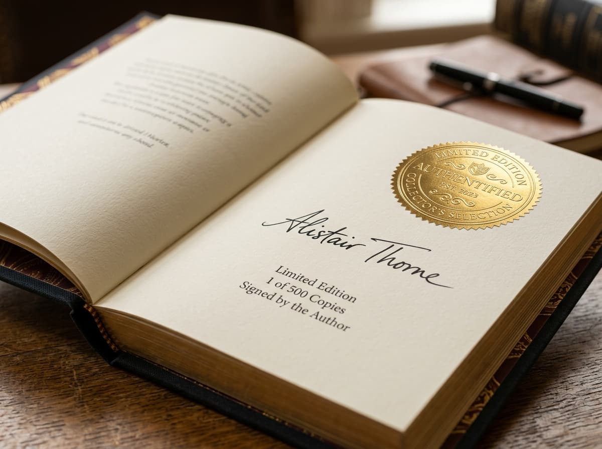
Interior Book Design & Master Typesetting
Nothing breaks reader immersion faster than an amateur, ragged interior. BloomPress engineers museum-quality InDesign layouts with calculated spine gutters, balanced leading, bespoke floral drop caps, and strict PDF/X-1a print preflight certification.
Typesetting Charter
PRINT-PERFECT ARCHITECTURE
Spine Gutter Compensation
We mathematically expand the inside margin so text never gets swallowed by the spine curve when the book is physically opened.
Zero-Widow / Orphan Rule
No lonely single words or trailing short lines at the top or bottom of pages. Every spread is balanced and optically pleasing.
PDF/X-1a Prepress Export
100% compliant with commercial printer RIP software. Fonts fully embedded, images at 300+ DPI, and zero transparency errors.
Custom Chapter Artistry
Bespoke drop caps, scene break ornaments, and elegant running headers customized specifically to your book's genre and mood.
How We Format Your Masterpiece
From calculating spine gutters to placing bespoke drop caps. A structured 4-stage journey that transforms raw text into a comfortable, elegant reading experience.
Grid Architecture & Trim Size Selection
"Proportional margins and spine gutter calculations."
Every masterpiece requires a solid foundation. We establish the geometric page grid based on your target book trim size (5.5x8.5, 6x9, etc.). We calculate the precise inner gutter margin to guarantee your text never falls into the spine crevice when opened.
Author Approval Gate
You choose your preferred physical book size and margin breathing room.
Stage Deliverables
Pass 1 of 4- Genre-tailored trim size recommendation & margin grid specification
- Calculated inner gutter compensation based on target page count
- Page density and comfortable line-length calibration
The Architecture of Timeless Typography
True literary formatting is more than margins; it is the rhythm through which readers lose themselves in your world. At BloomPress, our InDesign artisans sculpt balanced gutters, proportional leading, bespoke drop caps, and hypnotic scene breaks.
THE VELVET CIPHER
When the dawn broke over the high ridges of the printing valley, the scent of cold pine and crushed oak gall ink mingled in the courtyard. Every folio laid across the drying racks carried the deliberate touch of hands that revered the written word not merely as communication, but as permanent architecture.
For centuries, stories were whispered before they were bound. Yet within the walls of BloomPress, each sentence was treated as a living seed. The typography breathed; the gutters yielded just enough tension to draw the eye forward into the quiet majesty of the unfolding narrative.
The Science of Clean Layouts
Explore the exact geometric proportions, micro-typographic rules, and prepress certifications that ensure your printed book feels like a prestige literary release.
The Anatomy of a Professional Book Spread
Amateur Word documents use uniform 1-inch margins that look squished and fall into the binding. Professional InDesign layouts use mirrored, asymmetric margins calculated specifically for physical book physics.
- Spine Gutter (Inside Margin): Formatted at least 0.75" to 0.90" to prevent words from disappearing into the spine fold.
- Outer & Bottom Margins: Ample white space (0.60" to 0.75") providing a comfortable place for reader thumbs without obscuring text.
- Running Headers & Folios: Centered or alternating chapter titles and page numbers aligned cleanly with the optical baseline grid.
Calculate Your Physical Spine Width
Calculate exact spine thickness and full cover wrap dimensions based on your page count and binding choice.
Prepress Dimension Specifications
INGRAM CERTIFIEDPlain English. Zero Formatting Jargon.
The printing industry has dozens of confusing technical terms. Here is what they actually mean for your physical book.
Spine Gutter
Industry Jargon: "Medial bindery compensation margin"
What It Means To You: The extra white space on the inside edge of each page, preventing your words from curving into the glued spine when you read.
Drop Cap
Industry Jargon: "Initial capital inset ligature with descender suppression"
What It Means To You: An oversized, decorative initial capital letter that opens the first paragraph of a chapter, giving the page a classic literary elegance.
Widow & Orphan
Industry Jargon: "Singular short line paragraph terminations"
What It Means To You: An ugly typographic glitch where a single word is left alone on a line, or a single line is stranded at the top or bottom of a page.
Running Head & Folio
Industry Jargon: "Header pagination coordinate and recto-verso metadata"
What It Means To You: The top line showing your book's title and author name, and the page numbers placed at the bottom or top corners.
Bleed & Slug
Industry Jargon: "0.125-inch trim perimeter safety overprint zone"
What It Means To You: Extra artwork extending slightly beyond the trimmed edge of the paper so there are never white borders after the book is sliced.
PDF/X-1a Preflight
Industry Jargon: "ISO 15930-1 prepress compliance verification"
What It Means To You: A technical stamp confirming that every font and high-resolution image is permanently locked into the file, guaranteeing flawless printing.
Frequently Asked Questions
Honest, transparent answers about book interior layout and formatting.
What software do your typesetters use?
We design exclusively in Adobe InDesign CC—the global gold standard for book typography. We never use automated template engines or amateur Word exports.
Can I choose my own fonts and chapter opener ornaments?
Yes! At Stage 2, we present you with 3 customized chapter opener concepts featuring different font pairings, drop caps, and scene break ornaments tailored to your book's genre.
Will these files work with both IngramSpark and Amazon KDP?
Yes. Our master PDF/X-1a files meet the strict preflight requirements of IngramSpark, Amazon KDP, Barnes & Noble Press, and traditional offset printers.
What if I have images, charts, or tables?
We optimize all images and vector charts to 300+ DPI in CMYK or Grayscale, ensuring razor-sharp clarity without pixelation or printing artifacts.
Do I get to review the formatted book before it goes to print?
Absolutely. You receive a digital layout proof to inspect every page. We include unlimited minor pagination tweaks to ensure your book looks stunning.
Give Your Manuscript the Interior It Deserves.
Send us your manuscript details. Our InDesign art directors will prepare a complimentary 3-page layout concept with custom chapter flourishes.